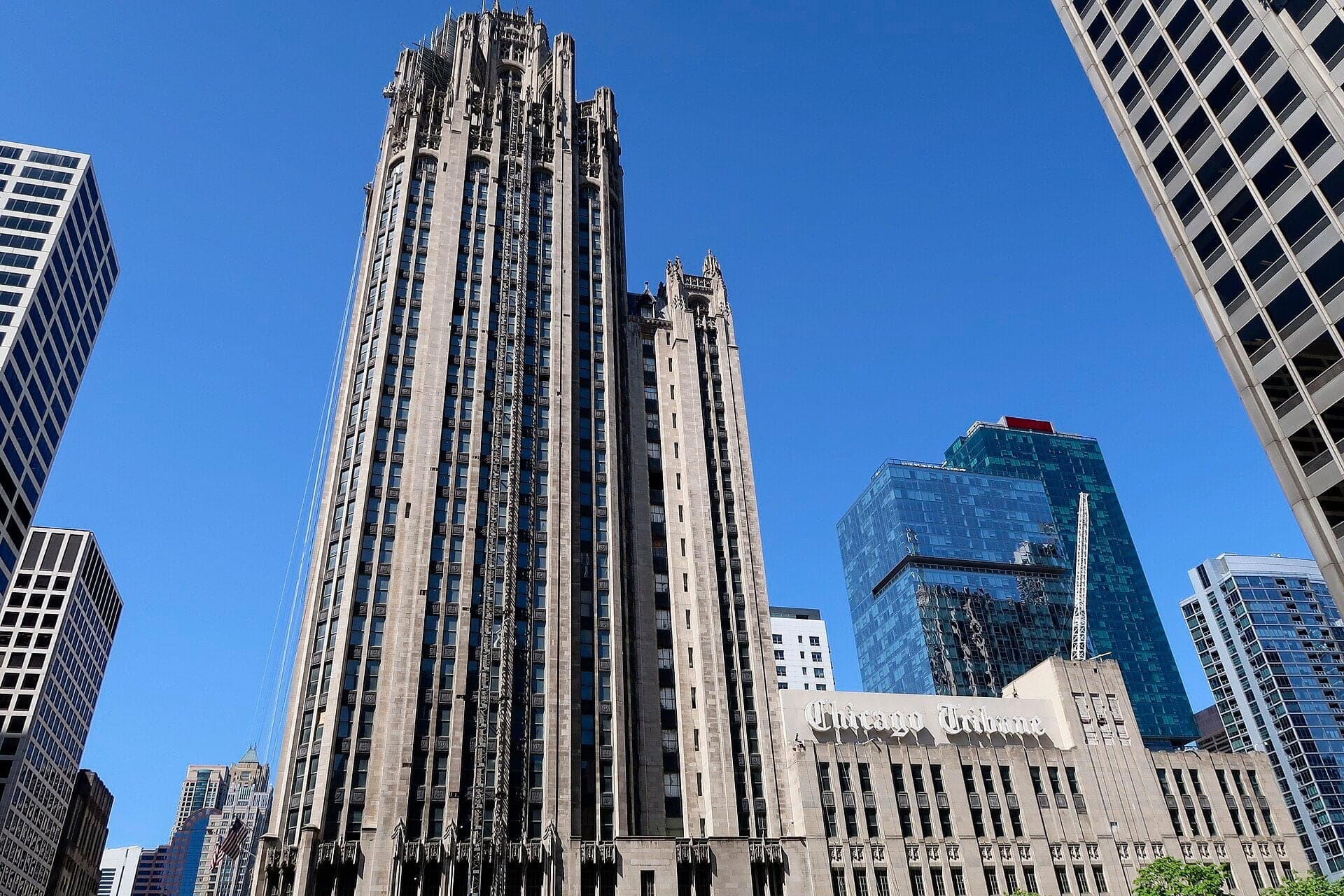
Tribune Tower stands on the east side of Michigan Avenue, on the north bank of the Chicago River, across the avenue from the Wrigley Building. It has thirty-six floors of gray Indiana limestone over a steel frame, and a crown whose flying buttresses derive from the south tower of Rouen Cathedral in France. It was built from 1923 to 1925. The architects were Raymond M. Hood and John Mead Howells, who won an international competition staged by the Chicago Tribune in 1922. The City made the exterior a Chicago Landmark in 1989.
The competition was the event. The tower is what got built. The drawing that echoed through American architecture offices for the rest of the decade, the City's own report suggests, was not the Gothic crown on Michigan Avenue. It was the runner-up.
The competition
The Tribune announced the competition on June 10, 1922, for the paper's seventy-fifth anniversary, and asked for the most beautiful office building in the world. The prize money was one hundred thousand dollars, with fifty thousand to the winner. The City's report counts more than 250 entries, and the Chicago Architecture Center counts more than 260 from twenty-three countries. The count is contested, so call it a little over two hundred and fifty. The entrants included Walter Gropius, Walter Burley Griffin and Adolf Loos. Loos proposed a giant Doric column. Saverio Dioguardi proposed a large classical arch. The jury was the Tribune's owners and executives plus the Chicago architect Alfred Granger.
About ninety percent of the entries, the report says, relied on historical precedent. That is the context for the winner. Howells and Hood drew a sober Gothic tower, vertical in its lines, crowned by buttresses that rose from the piers above the twenty-fourth floor. It was a serious commercial building dressed in the clothes of a cathedral.
The runner-up
Hear a stop from this walk
333 West Wacker and the Confluence: A Building Bent to the River
Second prize went to the Finnish architect Eliel Saarinen. The City's report says his entry was to exert a strong influence on skyscraper design during the late 1920s. Third prize went to Holabird and Roche. Louis Sullivan, the report adds, condemned the winner too vehemently. The record does not support naming a long list of towers that Saarinen's drawing produced, and other forces were at work in the same years. Chicago's 1923 zoning ordinance, which rewarded setbacks, arrived within months of the tower's start, and the Allerton Hotel, earlier on this walk, stepped back even before it did. What can be said is narrower and sturdier: the unbuilt tower is the one the Commission thought mattered for the next decade, and the built one is a well-loved Gothic tower that few architects went on to copy.
The stones
The other thing the Tribune Tower wears on its surface is a collection of fragments. Embedded in the street-level walls of the north, south and west facades are nearly one hundred and fifty pieces of other places. The site of origin of each fragment is engraved in the wall beside it. According to Wharton's study, the story goes that Colonel McCormick, a correspondent during the First World War, selected pieces from the rubble of a ruined cathedral and a city hall at the front. The Chicago Architecture Center says the earliest fragments were brought back by Tribune correspondents at McCormick's request. Later additions include a shard of the World Trade Center, set in 2002, and a Sydney Opera House tile, set in 2006. Among the places named in the wall are the Parthenon, the Great Wall, the Taj Mahal, Reims Cathedral, the Berlin Wall and Petra.
The stones are a self-promotional gesture. They are also a record of a particular confidence in the 1920s about a newspaper's place in the world. Architects do not often embed stones from the Parthenon in their buildings anymore. The 1920s did.
What to look for
Stand at the edge of Pioneer Court, on the east sidewalk of Michigan Avenue, with the tower right behind you at the south wall and the Wrigley Building across the avenue. Walk along the south face and the west face and read the stones at eye level. Each one has its place name carved beside it. Look for the carved dog and the Robin Hood figure by the main door, which the Chicago Architecture Center describes as the architects' joke on Howells and Hood. Then look up at the crown.
Pioneer Court is public ground and national history. The National Park Service records it as the site of Jean Baptiste Point Du Sable's house, and four bronze plaques in a marble block record it. The plaza was dedicated in 1965. Since 2018 the Tribune has no longer been in the building. It is now condominiums with shops on Michigan Avenue, so the exterior is the visit.
Then look across the avenue at the Wrigley Building, opened in 1921 in glazed terra cotta. Stone here, terra cotta there. Gothic here, French Renaissance detail there. The two buildings stand at the same bridgehead, four years apart. The bridge between them, the DuSable Bridge, is the next stop on the walk.
Ready to experience it?
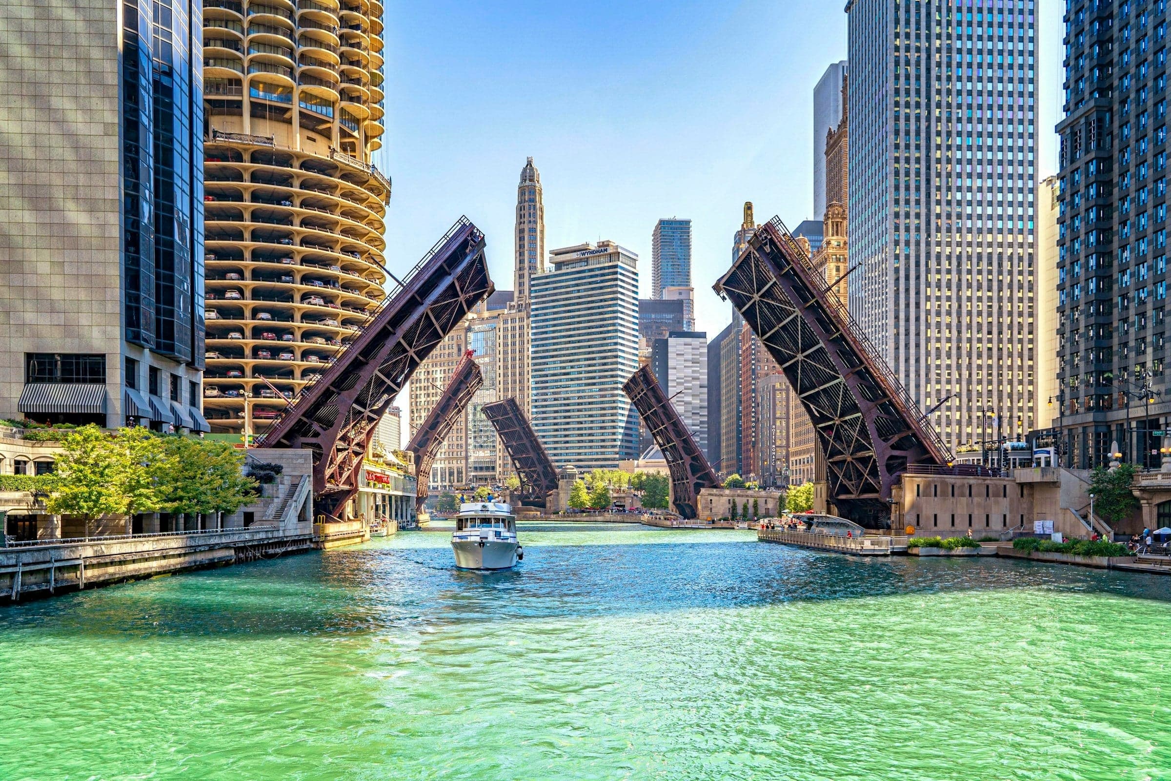
Chicago Riverwalk: From the Magnificent Mile Down to the Water
100 min · 2.4 km · easy
More from Chicago
Explore more at your own pace.
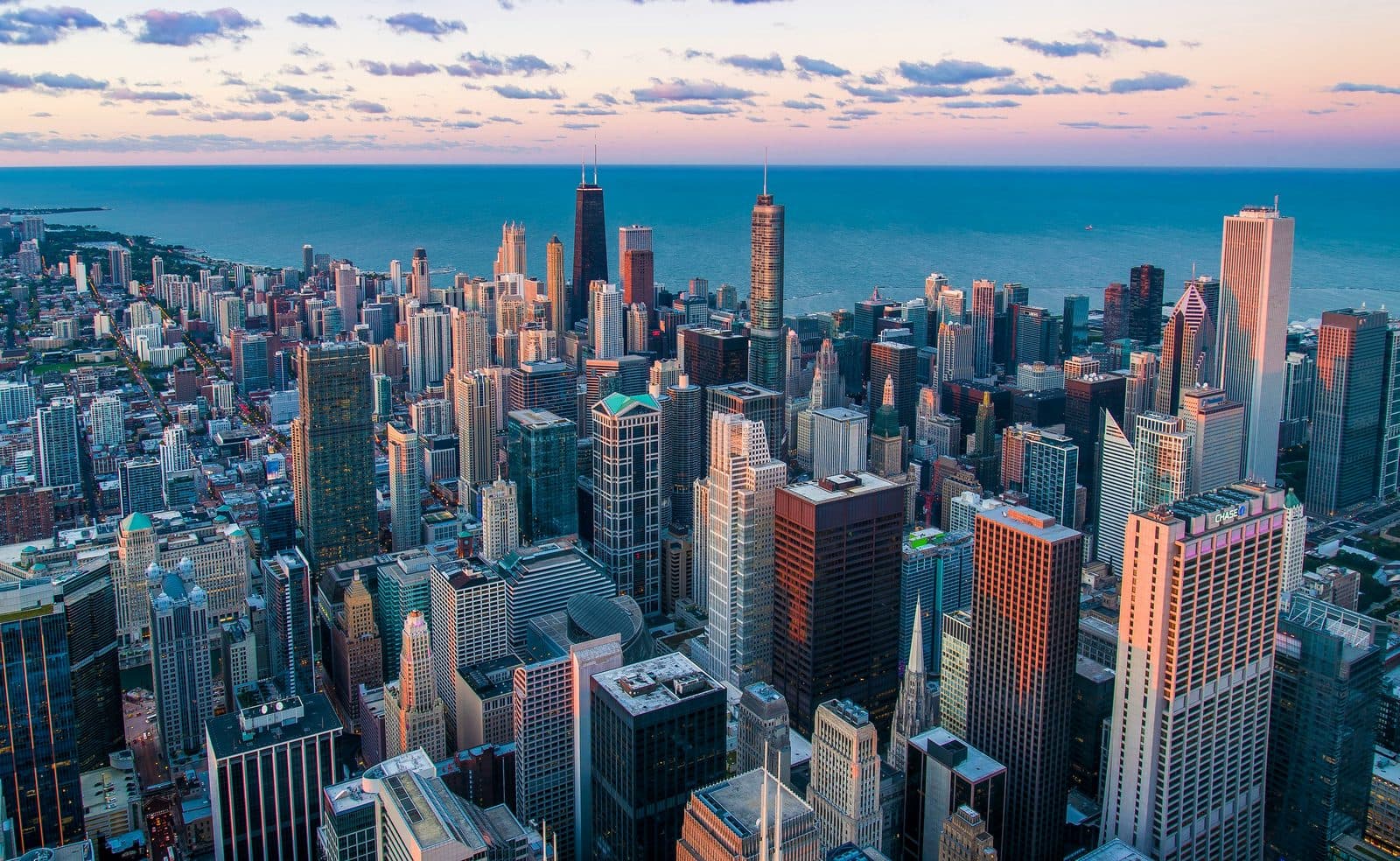
Chicago Travel Guide: How Many Days, Getting Around, When to Go (2026)
One Day in Chicago: A Walkable Downtown Itinerary (2026)
A Sunday on La Grande Jatte: Seurat's Park of Dots, in Chicago
Art Institute of Chicago: What to See, Building by Building
Paris Street; Rainy Day: Caillebotte's Nine-Foot Street Corner